Build Alpha

Equity Curve Trading

What is an Equity Curve?

An equity curve is a plot showing the growth of capital over time from one specific trading strategy or portfolio. Said another way, an equity curve shows the cumulative profit of a trading strategy over time.

Algo traders look at equity curves as a first step in determining the viability of a trading strategy. For example, the equity curve below shows how an account would have performed had it traded only one contract using the fourth Free Friday strategy.

Good equity curve bond market cumulative profit

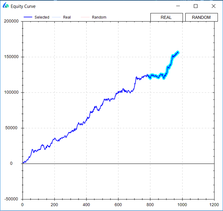
A rising equity curve warrants further investigation into a strategy’s robustness. Good strategies tend to move from the lower left to the upper right of the graph.

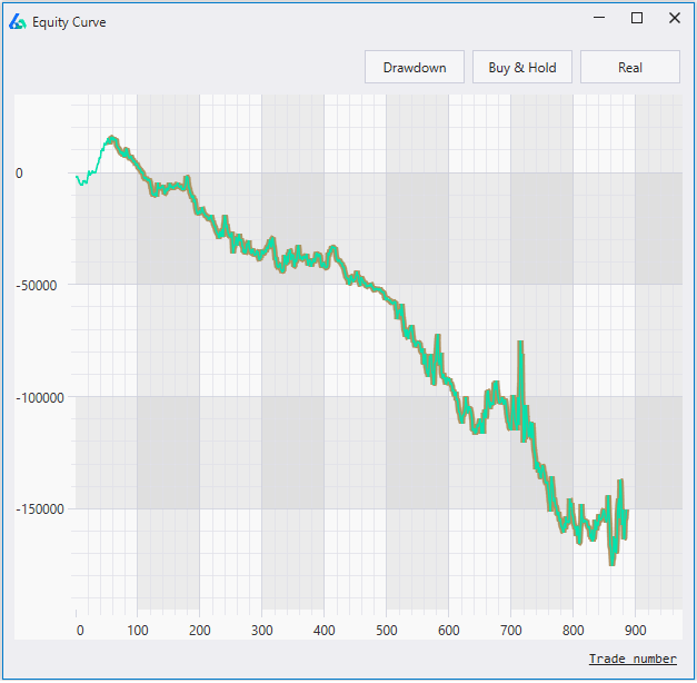
On the other hand, an equity curve with a negative return is moving in the opposite direction and most likely harmful for actual trading. A strategy like the one below can be discarded and does not need more of your time.

Bad equity curve stock market cumulative profit

How to calculate an Equity Curve

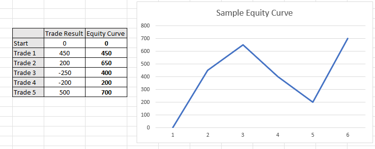
To calculate an equity curve we simply add each successive trade to the rolling sum. Assume a trading strategy made the following five trades: +450, +200, -250, -200, +500. To calculate the equity curve, we would simply add the trade results after each trade.

First, we have +450. Second, we have 450 + 200 or 650. Next, we have 650 – 250 or 400. Finishing this process results in the equity curve values +450, +650, +400, +200, +700.

Sample equity curve with cumulative profit calculation

What is Equity Curve Trading?

Equity curve trading, or managed equity curves, is using the equity curve of your trading strategy to make decisions about if you

  • should or should not take your strategy’s next trade
  • determine your next trade’s position size
  • should adjust your money management

A major fear in system trading is that often times your profit and loss or “equity curve” is your only feedback loop. That is, you don’t know when to stop trading a “broken” system until it has already cost you significant money.

One industry idea is to monitor the equity curve in comparison to a moving average of the equity curve. That is, if our equity curve falls below its rolling average of the equity curve then maybe it is a red flag or early warning sign the system is broken. On the other hand, if you are confident in your system then maybe this temporary sign of system weakness is actually an opportunity to trade larger!

Below shows an example of applying this equity curve trading technique to your own strategy and using the moving averages of the equity curve to approve trading signals.

Sample moving average equity curve trading to achieve profits

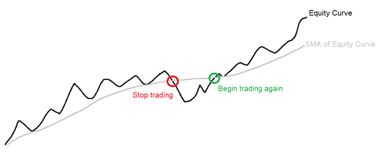
Some trading systems might miss significant drawdowns by simply turning off once the equity curve has weakened below its moving average and resume trading once the equity curve reclaims the moving average of the equity curve. The above example shows such.

Either way system traders need to know how their trading strategies perform when the equity curve weakens. If not, we are only to blame for our losses especially if we can identify some loss saving techniques ahead of taking a system live.

Equity Curve Trading Strategies

The trader should test various moving average parameter settings to find the best equity curve moving average to apply to each algo trading strategy. The most popular are the usual moving averages of lengths 5, 10 and 20 trades. Each strategy’s equity curve analysis will be different.

Most equity curve or performance-based systems can be defined as:

  • Skipping trades when equity curve is above a moving average of equity
  • Skipping trades when equity curve is below a moving average of equity
  • Skipping trades after consecutive winning trades
  • Skipping trades after consecutive losing trades
  • Skipping based on net profit
  • Skipping based on rolling Sharpe Ratio

Skipping or increasing size can be interchangeable. Optimizing moving average length or N trades for any of the above calculations can provide additional insights into improving trading strategies.

Rolling Sharpe Ratio to filter cumulative profit

The autocorrelation of the trading strategy’s returns will determine if one should stop trading after the equity curve falls below its moving average or if one should increase size. If the strategy’s returns show strong negative autocorrelation, then the latter makes more sense.

Is my Strategy Working?

Many traders and small investors monitor raw equity curves to make a decision on a strategy’s health. If the strategy falls below its moving average does this mean the strategy is broken? A disciplined trader may be wise to evaluate the strategy once live trading net profit falls below the equity curve of the strategy.

Monitor countless strategies trading health

However, wiser investment decisions based on strategy health and robustness are usually made using alternative stress tests. Equity curve strategies may reduce maximum drawdown but only where returns show serial correlation. That is, losses beget more losses and wins beget more wins. 

For more on Strategy Health insights, please check out the Robustness Tests Strategy Guide.

Equity Curve Trading Software

Most brokerage platforms do not enable this type of functionality to execute equity curve trading. However, Build Alpha makes it simple to test any strategy for various equity curve trading strategies across all financial markets.

Build Alpha

In the picture below you can see the thicker blue line represents our original backtest’s equity curve. This is how the strategy has performed ignoring all equity curve fluctuations. The nasty drawdown that concluded around trade number 740 is not a drawdown most traders could endure.

Build Alpha Equity Curve Trading Strategies

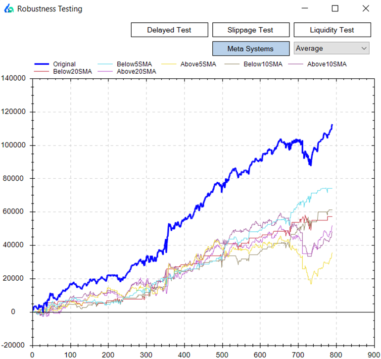
The baby blue line shows how the strategy performed only taking trades when the equity curve fell below its 5-period simple moving average. On the other hand, the yellow equity curve shows if you only took trades when the strategy’s equity curve was above its 5-period equity curve moving average.

You can see the baby blue returns are much smoother and avoided the most recent drawdown experienced around trade 740. In contrast, the yellow equity curve – only trading when the strategy was above its equity curve – caught all of the drawdown. In fact, the yellow equity curve had a worse drawdown than the original backtest.

Another Example

The blue and red lines show nice smooth returns whenever this strategy is below its 5 or 10 period equity curve moving average, respectively. On the flip side, the green and purple lines show how choppy and risky equity returns have been when only trading this strategy when above its 5 or 10 period equity curve moving average, respectively.

Build Alpha Equity Curve Trading Strategies 2

Need to Know

  • Equity Curve Trading can be applied to any asset class: stock market, futures, forex trading and even crypto currencies.
  • Equity Curve Trading can act as a money management technique and be applied to any used strategy.
  • The original strategy can use technical analysis, technical indicators, fundamental analysis, alternative data, data mining, various currency pairs, etc.
  • The most common equity curve trading strategy is comparing the cumulative profit of a trading strategy against a moving average of the cumulative profit. All things must be tested!
  • Build Alpha enables traders to monitor strategy results and numerous equity curve trading techniques.

Summary of Equity Curve Trading Strategy

Equity curve trading can provide valuable information that temporary weakness in a particular strategy has historically been followed by large drawdowns or by periods of out-performance and strategy recovery.

This knowledge can give insights to the trader on when to increase position size/leverage or to just simply have confidence in periods of equity curve drops, for example.

The main takeaway being… often smoother returns or a better risk-adjusted return can be achieved by considering the strategy’s “health” vis-a-vis the equity curve in relation to a moving average of the equity curve.

Following an equity curve trading technique will produce a new equity curve.

Update – Meta Strategies

Equity curve trading can be considered a Meta Strategy. A Meta strategy is a trading strategy that trades an underlying trading strategy. The idea is to develop an overlay strategy that will improve an existing trading system. Ideally, these layered decisions will increase overall net profit and performance as opposed to just following the original strategy.

The simplest Meta Strategy is to only take a trade if the underlying or original trading system’s last trade was a loser. Obviously, we can get more complex and say only trade if the original trading system’s last three trades were winners or, more probable, do NOT trade if the original trading system’s last three traders were winners.

Build Alpha displays all the 2 and 3 trade meta strategy scenarios for each and every system. BA also shows equity curve trading results for every strategy.

Meta Systems Display Build Alpha

Import Custom Strategies

A key feature of Build Alpha is the ability to import trading systems built outside Build Alpha and run all the robustness and curve fitting tests on them. For example, you could easily import your systems, view their equity curves, and check all these meta systems on all of your trading systems. This is far more helpful than learning a new technical analysis technique.

Build Alpha Custom Strategy Import

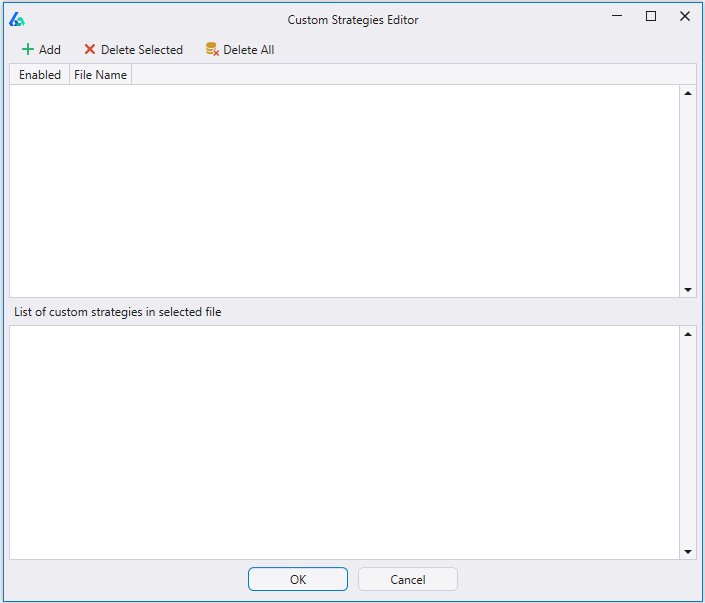
The image above is Build Alpha’s custom strategy import window.

Thanks for reading,

Dave

Learn more about Build Alpha and Equity Curve Trading

Contact me for the demo and watch how Build Alpha can easily demonstrate the best equity curve trading strategies for any trading inputs.

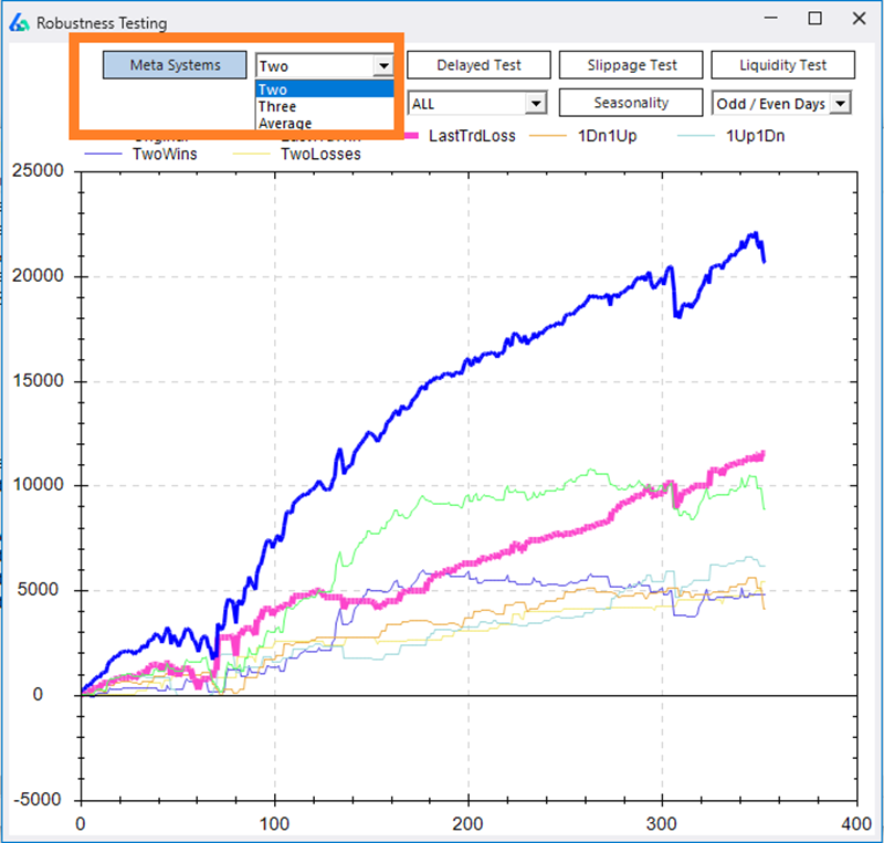
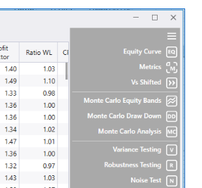
Locate the Robustness Testing Button

On the right-hand side of the results window, there is a button called ‘Robustness Testing’.

Build Alpha Strategy Results Tab

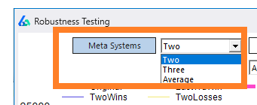
Change the Meta Systems view

Two displays all two trade scenarios such as: two consecutive wins, two consecutive losses, one win and one loss, one loss and one win, etc. Three displays all the three trade scenarios while Average displays moving averages of the equity curve trading.

Meta Systems Build Alpha Zoomed In

Author

David Bergstrom Author Photo Trading Edge

David Bergstrom – the guy behind Build Alpha. I have spent a decade-plus in the professional trading world working as a market maker and quantitative strategy developer at a high frequency trading firm with a Chicago Mercantile Exchange (CME) seat, consulting for Hedge Funds, Commodity Trading Advisors (CTAs), Family Offices and Registered Investment Advisors (RIAs). I am a self-taught programmer utilizing C++, C# and python with a statistics background specializing in data science, machine learning and trading strategy development. I have been featured on Chatwithtraders.com, Bettersystemtrader.com, Desiretotrade.com, Quantocracy, Traderlife.com, Seeitmarket.com, Benzinga, TradeStation, NinjaTrader and more. Most of my experience has led me to a series of repeatable processes to find, create, test and implement algorithmic trading ideas in a robust manner. Build Alpha is the culmination of this process from start to finish. Please reach out to me directly at any time.

Noise Test

First, let’s talk about overfitting and what it is. I will simply define it as fitting a function or model to data so well that the function or model is not generalizable and cannot/will not work on another data set.  In trading terms, it is designing a strategy that trades historical data so well that it will surely fail on new data.

When Out of Sample Data is Not Enough

The first and most obvious test to prevent curve fitting is out of sample testing. In other posts I’ve described this, but in short, it is simply withholding a portion of your data to “validate” the strategy. For example, you have 10 years’ worth of data and you designate the first or last 30% to be out of sample. You build your model on the remaining seven years of data and then validate it on the withheld 30% or out of sample data.

However, and for various reasons, this might not be enough to prevent against curve fitting. There are two parts to the underlying data: the signal and the noise. It is often said that when something is curve fit it is “fitted to the noise” and does not capture the underlying signal. The Noise Test is a test to see how close we have fit to the “noise” in our price data.

What is the Noise Test in Trading?

The Noise Test adjusts the original price data by differing amounts (user selected) creating hundreds of new volatility-adjusted price series to re-trade the strategy on. The idea being, that if the strategy cannot produce a profit on the newly created noise-adjusted data then it was overfit to the historical data’s noise (not capturing a real underlying signal) and unworthy of live trading. I wrote about an example strategy here: Noise Test Strategy Example

If you prefer a 30 second audio clip explanation of Noise Testing head here: Noise Testing Better System Trader Interview

How Does It Work in Build Alpha?

For example, the trader can select to change up to 40% of the opens, 60% of the highs, 50% of the lows, and 75% of the closes. Additionally, the trader can select by how much he’d like to adjust the price data – let’s say by up to 33% of the average true range. Here’s what this exact configuration would look like in Build Alpha. Then simply hit the Noise Test button from the right-hand panel of the results window to run the test.

What Does Noise Adjusted Data Look Like?

Below I’ve attached photos that show 4 “noise altered” price series created with the settings above for the S&P500. The charts below display the period of the August 2015 ETF crash. You can see how some bars have changed and some have even turned positive when originally negative and visa versa.

It still mimics the original S&P500 data and that is ideal as we want to keep certain elements of the original data such as the volatility clustering, e.g. However, we’ve changed the amounts of noise in each newly created series by adding or subtracting various amounts.

*Actual Price Data*
Noise Altered
Noise Altered
Noise Altered
Noise Altered

Here is an additional view of seeing how the Noise Test adjusted the underlying data. Click on the below image to watch the 15 second gif.

Noise Test Gif

Analyzing the Noise Test Results

After adjusting the data, the Noise Test will then trade the strategy on each newly created price series and display the resulting equity curves. If the original strategy was “fitted to the noise” then the strategy should not maintain profitability as we adjust the noise in the data. However, if the Noise Test results remain profitable then we can have increased confidence a strategy was trading the underlying signal and not the “noise”. Below is the output of the Noise Test in Build Alpha.

Thanks for reading,
Dave

Additionally, if you’re interested, I wrote a piece featured in SeeItMarket.com where I used the Noise Test to identify a lying backtest. Lying backtests are misleading and cause traders to risk hard earned money on false positives. If you’re curious to learn other stress tests, check out this full Robustness Testing Guide I put together.


Update – Advanced Uses of Noise Test

Build Alpha now permits the trader to add noise-adjusted data series into the optimization process. This Noise Test Parameter Optimization can produce more stable or robust parameter settings because we are optimizing on noise-adjusted data and not the single historical price path (that is unlikely to repeat). To read more about it and view a case study, please check out this post: Noise Test Parameter Optimization

Algorithmic Trading Parameter Optimization Build Alpha

E-Ratio

Edge Ratio or E-Ratio measures how much a trade goes in your favor vs. how much a trade goes against you. The x-axis is the number of bars since the trading signal. A higher y-value signifies more “edge” at that step in time.

Measurements are normalized for volatility; this allows us to use e-ratio across all markets and regimes. Once normalized for volatility, 1 signifies that we have equal amounts of favorable movement compared to adverse movement.

In other words, the y-axis is an expression of how many units of volatility more or against you your trade gets. A measure of 1.2 would indicate .2 units more of favorable volatility and a measure of 0.8 would indicate .2 units more of adverse movement.

The blue line is for the selected strategy’s signal and the red line is for a “random” strategy for the same market. The red line is to serve as a baseline to beat. Ideally, you’ll want to see a blue line above 1 and above the random line.

You may find many “good” strategies, but they may have an E-Ratio less than the red baseline or less than one. This would make us less confident that our signal will withstand the test of time.

Additionally, if E-Ratio falls off a cliff at bar 6… then it probably does not make sense to hold for 15 bars!

Another tool to make sure Build Alpha + Trader = Success.


How to calculate:

  1. Record Maximum Adverse Excursion and Maximum Favorable Excursion at each time step since signal.
  2. Normalize MAE and MFE for volatility. To compare across markets we need a common denominator. Let’s use ATR or a unit of volatility.
  3. Average all MFE and MAE values. Now you should have average MFE and average MAE at 1 bar since signal. Average MFE and average MAE at 2 bars since signal…
  4. Divide Average MFE by Average MAE at each time step.

Example. Calculate E-Ratio at one bar out from signal.

Signal 1:

MFE 1.50            ATR 1.27

MAE 1.00            ATR 1.27

Signal 2:

MFE 1.33            ATR 1.19

MAE 1.04            ATR 1.19

Signal 3:

MFE 1.83            ATR 1.67

MAE 1.27            ATR 1.67

Average MFE = ((1.50/1.27)+(1.33/1.19)+(1.83/1.67))/3 = 1.13

Average MAE = ((1.00/1.27)+(1.04/1.19)+(1.27/1.67))/3 = 0.81

E-Ratio at Bar One = 1.13/0.81 = 1.395

So in this example, one bar after our signal, we can expect ~.40 more units of volatility in our favor than against us. In other words, if ATR is 20 points then we can expect the trade to move on average 8 points (8/20 = .4) more in our favor than against us 1 bar after the signal is generated.

** Update **

I spoke quite a bit about E-Ratio or Edge Ratio in a recent podcast interview with Andrew over at BetterSystemTrader.com/79

Please check it out and let me know what you think. Thanks.

Thanks for reading,
Dave

Randomized Out of Sample

What is Out of Sample Testing?

Out of sample testing is purposely withholding data from your data set for later testing. For example, let’s say we have ten years worth of data and select to designate the last 30% of the data as out of sample data. Essentially what we do is take the last 3 years (30%) of the data set and put it in our back pocket for later use. We then proceed to create and optimize trading strategies using ONLY the first 7 years of data or the “in-sample” data. 

Let’s assume we find a great looking strategy that performs extremely well on the first 7 years worth of data. What we would then do is take the last 3 years worth of data, or our out of sample data, out of our back pocket and proceed to test our strategy on this “unseen” data.

The idea is… if the strategy still performs well on this unseen, out of sample data then it must be robust and we can have increased confidence it will stand the test of time or at least in how it will perform on future market data.

To read more about out of sample testing please check out these

Pitfall of Out of Sample Testing

However, there is a major pitfall to the above approach given certain data sets. What if our amazing looking strategy happened to be long only and only performed well on our unseen, out of sample data because the last 3 years (our 30%) were extremely bullish. See picture below (red marks last 30% of data). Is it possible any long strategy would have passed this out of sample period?

What’s a solution? What if we use the first 30% of the data instead of the last 30%? What if we use some middle 30% of the data? Well, we actually still run the risk that any continuous 30% of the data may be extremely trendy. Here is a photo showing a strong trend in the beginning 30% of a data set.

Here is a photo showing a strong trend in the middle 30% of a data set:

Randomized Out of Sample Testing

The answer? Let’s take our original backtest results and run them through a randomized out of sample test. First, we randomly select dates until we have randomly selected 30% of the dates from our data. Now we have a “randomized out of sample” period to put in our back pocket. Basically, we will then run through our entire data set but filter out any trades that would have occurred on our now randomly selected, out of sample dates.

Then we can view the results of the trades that only took place on our randomly selected out of sample dates as a new “quasi-out of sample” equity curve. We have now significantly reduced the chances that any successful out of sample performance is solely due to some underlying trend or market regime as our out of sample data is now no longer continuous. Here is an example of random 30% of data selected for out of sample.

Is one test enough?

However, one more problem remains. What if we randomly created a trend or favorable market regime through our random sampling/selection? That is, we’ve randomly selected 30% of the dates and when they’re put in chronological order for our out of sample testing they coincidentally create a massive up trend that could skew our new out of sample results?

The answer? Run this test 1,000 times where we re-select a new random 30% of the dates (or bars) each time to act as our out of sample period. Some may create a favorable market regime, but we can see how our sample strategy does over a variety of randomly created regimes or out of sample periods.

Build Alpha Solution

Build Alpha offers this complete process and test with the click of a button. The leftmost graph below is the in-sample equity curves from the 1,000 runs. These are basically trades that occurred on dates that were NOT randomly selected to be part of the out of sample period. The middle chart is our randomized out of sample test. These are the equity curves from the 1,000 runs of the trades that occurred on the dates that were randomly selected. The thick blue line on the left and middle graph are the in and out of sample tests from our original back-test. The rightmost chart is simply the original back-test for reference.

Analyzing Randomized Out of Sample Results

Example 1

The example below shows our original backtest’s out of sample equity curve to be at the very top of the distribution of all the random out of sample tests (middle chart below). This is a sign that the underlying data contributed quite favorably to our results and may have produced unrealistic or unrepeatable out of sample results (most likely something like the first picture of this post where the last 30% of the data is considerably bullish).

Example 2

In the picture below I’ve displayed a simple demonstration that would show a “passing” random out of sample test or a situation where you can feel comfortable the original out of sample period is a “fair” period of time. The middle graph’s thick blue line (our original out of sample results) is in the middle of the random out of sample distribution. This means as we randomly selected random out of sample periods we created some out of sample equity curves that had better results than our original backtest and some that had worse results than our original backtest. This can only mean that our original out of sample period was “fair” and did not overly contribute to the favorable results, but rather the favorable results come from the strategy itself.

Takeaways

We know we want to test on “unseen” data, but also want to reduce the chances that an underlying trend produced favorable out of sample results. In order to avoid being fooled by a favorable out of sample period, we randomly create thousands of out of sample periods and want to see general profitability across them all.

If the original backtest’s out of sample line is significantly greater than all the randomized out of sample equity curves then we can conclude we had originally selected an overly optimistic out of sample period that contributed too greatly to our strategy’s out of sample success (similar to the first photo in this post).

Additionally, if our original backtest’s out of sample line is one of the worst performers compared with the randomized out of sample equity curves then we can conclude the original out of sample period chosen may actually be too unfavorable (and throwing the strategy away based on out of sample results alone may be ill-advised).

All in all, Randomized Out of Sample testing is just one more test Build Alpha offers to provide the utmost confidence a strategy will perform to expectation moving forward.

Thanks for reading,
Dave

To read about more advanced tests to create confidence in your trading strategies check out this complete Robustness Testing Guide.

Free Friday 11 – Sample Size

For this week I want to discuss personal comfort regarding sample size or number of trades. I often get asked to generate strategies that are more “swing-trade” oriented and hold for days to weeks.

I have no problem with these types of strategies and Build Alpha can certainly build them. This Friday’s strategy is exactly that, but at the end I explain my thoughts regarding this style of trading.

This strategy shorts the EURUSD futures whenever these 3 conditions are true:

  1. Today’s close is below today’s open
  2. Low[7] > Open[9]
  3. US 30Yr Bond’s High[0] <= US 30Yr Bond’s Open[2]

The exit conditions for this strategy are as follows:

  1. Maximum hold of 20 days
  2. 2.00 * 20 Period ATR Profit Target (Calculated at Entry)
  3. 1.50 * 20 Period ATR Stop Loss (Calculated at Entry)

Below I’ve attached a chart of the equity curve in TradeStation (left – by trade number) and the equity curve vs. S&P500 on the right generated by Build Alpha (by date).

As you can see these type of exits drastically reduce the number of trades (compared to say a 1 day maximum hold). Without getting technical, the more trades the lower the chances the strategy may be a “fluke”.

This strategy’s out of sample period began in 2012 which means that this strategy has had its last 20+ trades on “unseen” data and did quite well.

Some may say that is fine and they’re ready to proceed with this strategy, but others may say that this is not enough trades. This essentially comes down to personal preference.

The important note I’d like to make is… Build Alpha allows you to discard strategies that the software generates that do not have a certain number of trades.

For example, your personal preference might require at least 500 out of sample trades. If so, you would simply enter that number into Build Alpha and the software would then discard any strategies that do not trade frequently enough during the strategy generation process.

Free Friday 10 – Properly Funding a Strategy with Monte Carlo

In this week’s Free Friday strategy (#10) I want to talk about one method of using Monte Carlo analysis to properly size a trading system – again, this is just one method!

The strategy itself is one created for the Semiconductor ETF or $SMH. All you Dow theorists – if any remain – can rejoice!

The strategy uses 4 rules for entry:

  1. 20 Period ATR[0] <= ATR[2]
  2. High[1] <= Close[7]
  3. High[5] > Low[8]
  4. Low[4] <= High[8]

**Remember [0] means current bar and [2] means 2 bars ago**

The exits used are a 7 day maximum hold or exit after 3 profitable closes. The stop will be a rolling 5 day minimum low. That is, stop out at the lowest low of the previous 5 days.

Couple quick notes. The chart on the left is from TradeStation and the chart on the right is from Build Alpha.

Notice TradeStation x-axis is trade number and Build Alpha x-axis is by date (both can display either way).

The grey line is buy and hold for SMH. You can see since early 2012 (the beginning of our out of sample period) we have much superior risk-adjusted return.

Also, please note that the test was done using only 100 shares per trade. This is essentially nothing, and does not account for underlying price changes over time, but this post is for demonstration purposes only.

Sizing with Monte Carlo Analysis

A quick recap of what a simple Monte Carlo test can be… we will reshuffle the order of the trades 1,000 times. Each time we will re-create an equity curve by adding the newly shuffled trades up one by one. Each time we will calculate a max drawdown as if the trades had actually happened in this shuffled order.

For the first test, I assumed an account size of $2,500.00. I ran the Monte Carlo test using Build Alpha which created 1,000 new drawdowns and the picture below. For example, the first Monte Carlo run (1 of 1000) might have calculated a $275.00 drawdown on the reshuffled trades or an 11% drawdown (275/2500). The second Monte Carlo run (2 of 1000) would reshuffle the trades and might recalculate the drawdown to be $450.00 on this random ordering of the trades; that would be an 18% drawdown (450/2500). After 1000 reshuffles we are left with the image below – all done instantly.

The green bars are just a frequency distribution of the [percentage] drawdowns. The blue, more important, line is a cumulative distribution which adds the green bars up as you move left to right.

The red “X” shows that 95% (y-axis) of all the drawdowns were less than or equal to 30% (x-axis). So we can say “we are 95% confident our drawdown should not exceed 30% of the our $2,500.00 account”. In other words, we have a 5% chance of experiencing a 30% or more drawdown trading this system.

Furthermore, the drawdown from the original backtest was 15.6% (391/2500) based on this $2,500.00 account. However, according to our Monte Carlo Drawdown analysis we have over a ~38% chance of realizing a drawdown equal to or greater than our max drawdown from the backtest of 15.6%! That’s too high and already Monte Carlo has helped make us more aware traders of the risk we are assuming. I calculated 38% by locating the blue line’s y-value where the x-axis was equal to our 15.6% drawdown. The blue line’s value was approximately 62. So 62% of our Monte Carlo drawdowns were less than or equal to our max drawdown from the backtest. In other words, a 38% chance to see a greater drawdown like I previously mentioned.

That is too high for me; a 30% drawdown can be unbearable and 30+% chance of exceeding our backtest drawdown is too high. Let’s increase our account size to $4,000 and re-run the Build Alpha Monte Carlo Drawdown analysis. Pictured below:

Now you can see that 95% of our drawdowns (red “X”) were 18% or less. In other words, there is only a 5% chance we will experience a drawdown of 20% or more using a $4,000 account. That is comfortable levels and chances of drawdown to most.

Now the question becomes… is setting aside $4,000 to COMFORTABLY trade this system worth the return this system can generate? That is a more personal question, but a question we will dive into in later posts.

Cheers and enjoy the 3-day weekend,

Dave

Old Posts:

New Posts:

Thanks for reading,
Dave

Free Friday 9 – Intermarket Signals

What is Intermarket Analysis?

Intermarket analysis is a method of analyzing one market based on another market or their intermarket relationship. Common intermarket analysis techniques include correlation, cointegration, and relative value. However, in its simplest form, one can also trade one market based on what another market is doing on its own. 

Intermarket Analysis Trading Strategy Example

In this week’s Free Friday strategy (#9) I display a strategy built using inter-market signals. Inter-market signals/analysis is the ability to generate trading signals and filters for a primary market based on what another market may be doing.

For example, you may only want to buy the stock market when gold is trading lower or when bonds are below their 200 simple moving average.

Build Alpha now let’s you test these exact sort of scenarios and build strategies taking into account up to 3 markets (plus Vix). This specific strategy was built for SPY (S&P500 ETF) but takes into account Gold (GLD ETF) and holds for a maximum of 2 days.

There are no other exit rules or sophisticated risk management; all trades assume only a 100 share position for testing purposes.

The Entry

1. $SPY’s 2-period RSI <= 90
2. Gold’s 50 period simple moving average is greater than Gold’s 200 period simple moving average
3. Gold closed below both its 10 period simple moving average and its 50 period simple moving average

The Exit

Exit after holding for 2 days

Intermarket Analysis with Build Alpha

For a better explanation of inter-market signals and how to configure Build Alpha to generate strategies based on them please watch this short video I made: https://www.youtube.com/watch?v=CaFRO_gvR-8

There might even be TradeStation/MultiCharts code in the video?!?

Step 1 – Select Symbols

In the upper left, select the primary symbol in the Symbol dropdown. This is the primary market that the automated trading strategy will execute trades on. Next, select a symbol for market 2. This is the secondary market we can use to generate intermarket technical analysis signals.

Step 2 – Select Signals

Scroll down in the built-in signal library and notice signals prefixed with “market 2”. These signals are calculated on market 2 and can be used to generate signals to trade the primary symbols. If you have selected a symbol for market 3 you may also notice signals prefixed with “market 3”. 

Step 3 – Run Simulation

After selecting your symbols and signals, hit simulation. Build Alpha will begin building the best automated trading strategies based on your inputs. If the strategy results do not use any market 2 (or market 3) signals that is because these signals did not improve or enhance performance. 

Thanks and enjoy the weekend,

-Dave

Thanks for reading,
Dave

Read more:

Free Friday January 2017 Update

Happy Friday!

For this Free Friday edition I will just share an update of the first 7 Free Friday strategies. One month is not indicative of anything and these are just meant for educational purposes (strategies may or may not have gone through the entire rigor of the robustness/validation techniques described on this site).

I post the strategies on twitter and you can follow me here: @dburgh.

Free Friday #1: eMini S&P500 +$625.00
Free Friday #2: Gold Futures +1,630.00
Free Friday #3: Oil Futures -$310.00, +$2,940.00, +$470.00
Free Friday #4: US Bond Market No Trades
Free Friday #5: Nasdaq Futures No Trades
Free Friday #6: Russell Futures -$790.00,-$490.00,-$765.00,+$310.00,+$985.00,-$315.00
Free Friday #7: SPY ETF No Trades

January Total: +$4,290.00

All in all, not a bad month. A few things to consider… 1. One month(11 trades) is by no means telling, but it is sure nice to see profits. 2. Not all these strategies went through the full spectrum of validation techniques. 3. Strategy #6 only has 1 rule so it is much more common for its entry condition to be satisfied; hence the larger number of trades. 4. All of these results based on 1 contract traded

If you missed Free Friday#8 where I broke down one of the new validation techniques, Randomized Monte Carlo testing, then please take a look here: Free Friday 8 – Randomized Monte Carlo

Enjoy the weekend,
Dave

Thanks for reading,
Dave

Free Friday 8 – Randomized Monte Carlo

Randomized Monte Carlo Strategy Analysis

In this Free Friday, I want to introduce a new feature to Build Alpha: The Randomized Monte Carlo Test. The purpose of this test is to give us another robustness test or tool to identify potentially unreliable trading strategies or lying backtests. 

As system traders, all we can do is improve the probabilities that the strategies we take live will succeed. Identifying lying backtests or misleading results can both save the trader money and headaches. 

The strategy below shorts the EURUSD futures contract and has shown nice results on both in-sample and out-of-sample testing from 2002 to 2017 with a fairly large sample size of over 600 trades. Should we greenlight this strategy and trade it live?

All performance metrics and even the simple reshuffle monte carlo method (pictured below) seems to give favorable insights to trading this strategy live. This strategy shows almost all Monte Carlo paths are profitable after 150 trades. Should we go live?

Let’s introduce one more test, the Randomized Monte Carlo test. This test can help us determine if this strategy’s backtest is lying to us and can potentially harm our account.

What is the Randomized Monte Carlo Test?

The Randomized Monte Carlo test re-trades the entry signal while modifying each trade’s exit at random (and within reason). The Randomized Monte Carlo test will not introduce new exit logic or remove any exit logic. That is, if the original strategy does not use a stop-loss then the Randomized Monte Carlo test will not introduce one. This is vital as altering the strategy’s logic can alter the underlying strategy to the point where the results do not tell us anything informative about the original strategy.

This particular strategy uses three unique exit strategies:

  • Maximum 3-day hold  ||  First profitable close  ||  Stop at rolling 5-day high

In the Randomized Monte Carlo test, trade one will enter as expected but we may exit with a two-day max hold, first profitable close, or stop at the rolling four-day high.

The second trade will enter as expected but we may exit with a three-day max hold, second profitable close, or a stop at the rolling five day high.

Trade three will enter as expected but we may exit with a three-day max hold, first profitable close, or stop at the rolling seven day high.

This process will repeat for ALL the trades randomizing the exit each time. The first three hypothetical trades of the first run, that are stated above, are summarized below for simplicity and comparison’s sake. Again, this is random so you can imagine the variations possible.

  1. Maximum 2-day hold  ||  First profitable close       ||  Stop at rolling 5-day high
  2. Maximum 3-day hold  ||  Second profitable close  ||   Stop at rolling 5-day high
  3. Maximum 3-day hold  ||   First profitable close      || Stop at rolling 7-day high

We then repeat this test and re-trade the strategy 1,000 or more times to make sure we have a reliable sample and remove any lucky “randomizations”. The results of this test on this Free Friday strategy are below. Yikes. 

What does the Randomized Monte Carlo Test tell us?

In this particular example, this test and new feature in Build Alpha was able to identify a lying backtest and save us from implementing a false positive or “too good to be true” trading strategy. 

The test is intended to validate we have not overfit our exit strategies/signals. If the Randomized Monte Carlo results are all positive, then it can tell us that our strategy’s entry has enough edge worth harvesting and could maintain profitability even with random exits. However, seeing struggling results like the graph above indicate a lying backtest and potentially overfit exits. This is just another tool in our trading toolbox to help prevent or reduce the risk of curve fitting.

For instance, strategies showing nice equity curves but poor edge ratios are always suspicious. The Randomized Monte Carlo test is a good candidate here and can identify overfit exits that are squeezing out profits when the edge ratio indicates there should not be much! Anyways, more to come in Build Alpha on strategy robustness and reliability.

Thanks for reading,
Dave

Read the Full Monte Carlo Simulation Guide (free equity curve simulator).